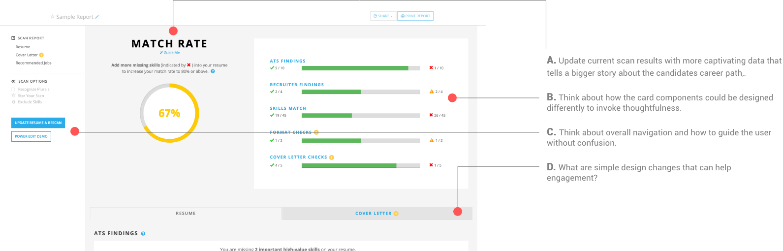
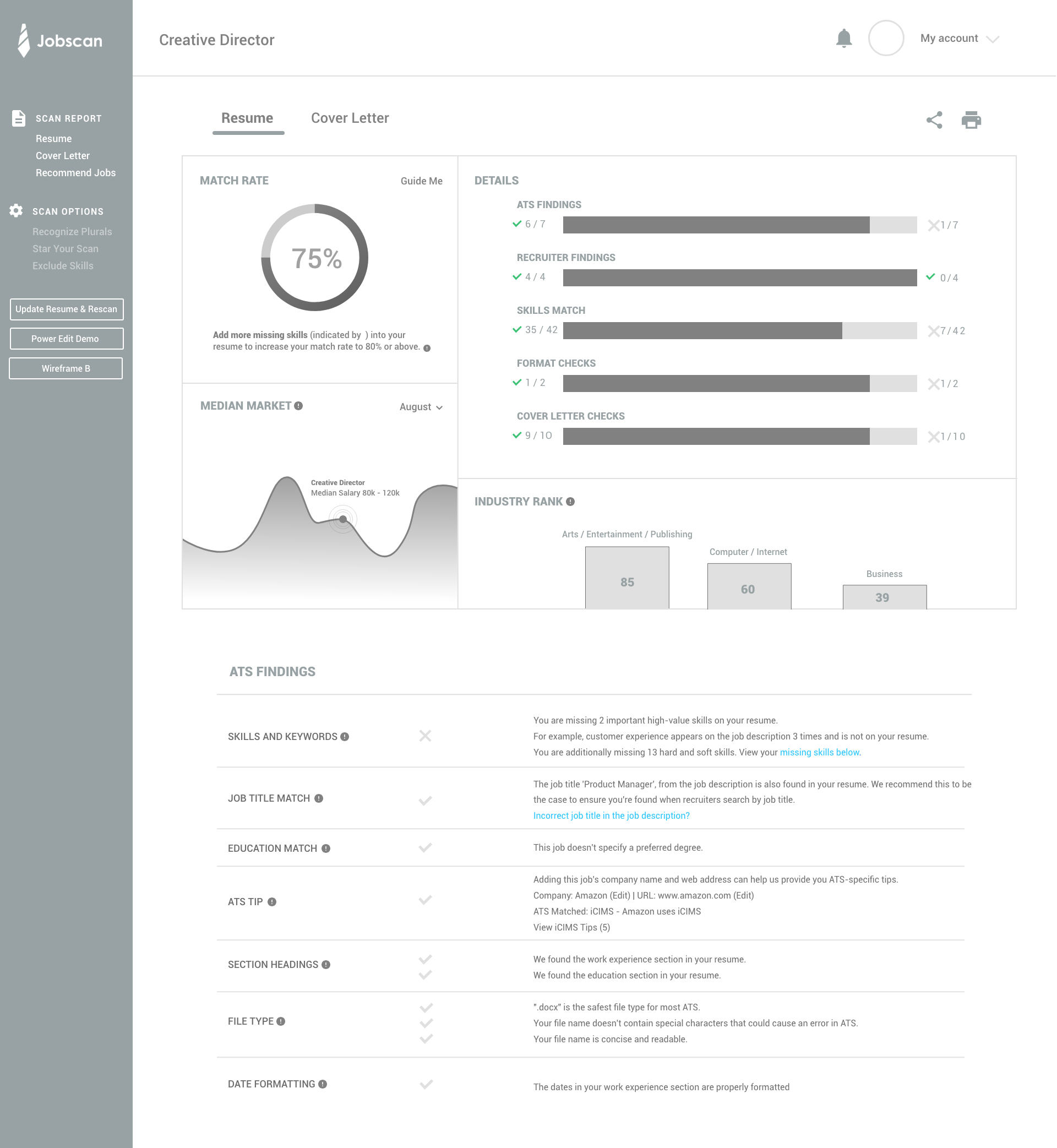
Redesign the Match Rate results page.
Customers are not engaging with the site enough and finding solutions with the results.
Overall I think the results page offers a lot of helpful tips about how your current resume stacks up against the job description, and the information that needs to be added for a better score.
Currently, the dashboard section of this part can benefit by featuring helpful data to give them a stronger impression on how well their resume does in the market, alluding to the bigger picture about their current career path, and how to let people understand their market value, as well as their resume performance.
Increase engagement with thoughtful design changes that expand the product value.
Designed a scenario to help discover what some of the main wants and needs are from JobScan.
The story arc dives into the mindset of someone who needs to improve their resume and get passed applicant tracking systems for qualification. .
Learning common patters and user flow of the results page.
Focus points and reasons for redesign.
Final wireframe designs that continued into the visual design phase.
Easy to scan and retrieve match results with the least user effort.
Visualize meaningful data that tells a bigger story.
Easily identify and filter through resume findings with a modern design language.
Final main page design with all the elements and a few different variations for final review.